Martha Stewart Redesign
New information architecture, page templates, and responsive web design.
Client: Martha Stewart Living Omnimedia
Role: Director of User Experience





Description:
My role in the redesign of MarthaStewart.com very deep, covering directorial duties, ideation, hands on involvement in the video experience, and constant multi-tracked work involving an array of technologists, visual designers, editors, a taxonomist, and a content strategist. At the strategic level, UX goals were to:
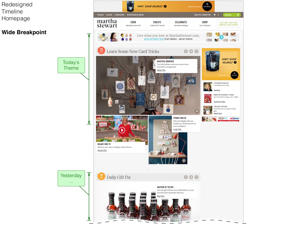
- Unfold valuable content at the discovery (browsing) phase of user engagement with large, luscious photography. Why hide your greatest asset?
- Redesigned search to better match user behavior with an emphasis on only key information, large photography, and minimal but easy to use filtering.
- Reduce the visual complexity of each page into easy to parse strata so the user can focus on fewer tasks at a time.
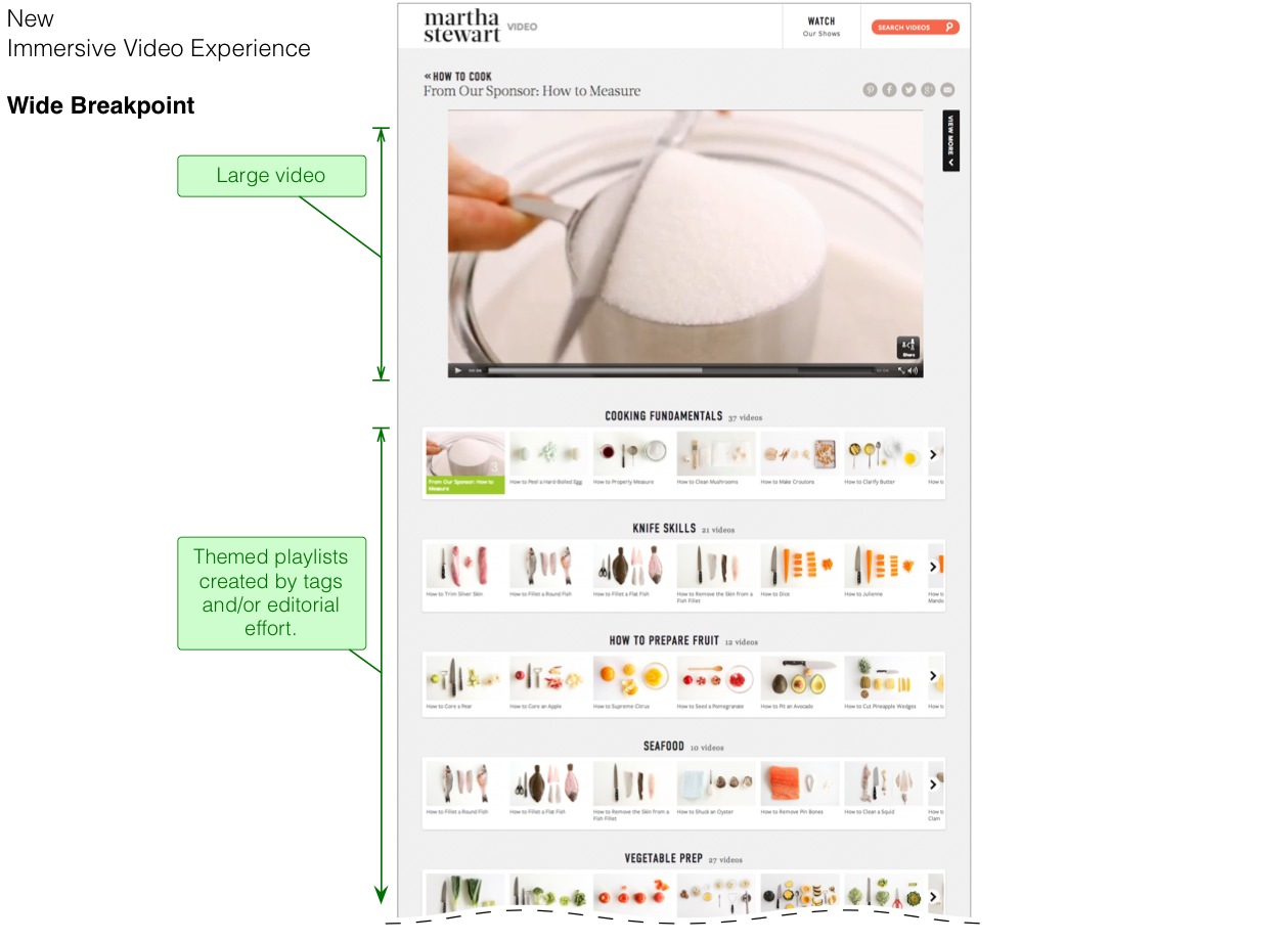
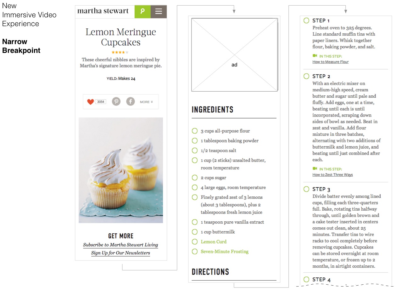
- Emphasize and expose actionable video content as recirculation on atomic pages, such as instructions, techniques, and component recipes.
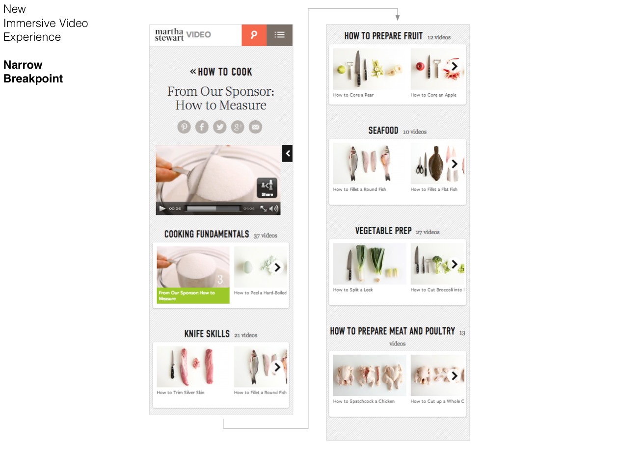
- Deliver an immersive video-first viewing experience to better monetize the back catalogue of content and a new video-first Everyday Food with Sarah Carey series.
- Give users a way to become connected with the content through user actions and sentiment with "I Like This," and "I Made This" actions.
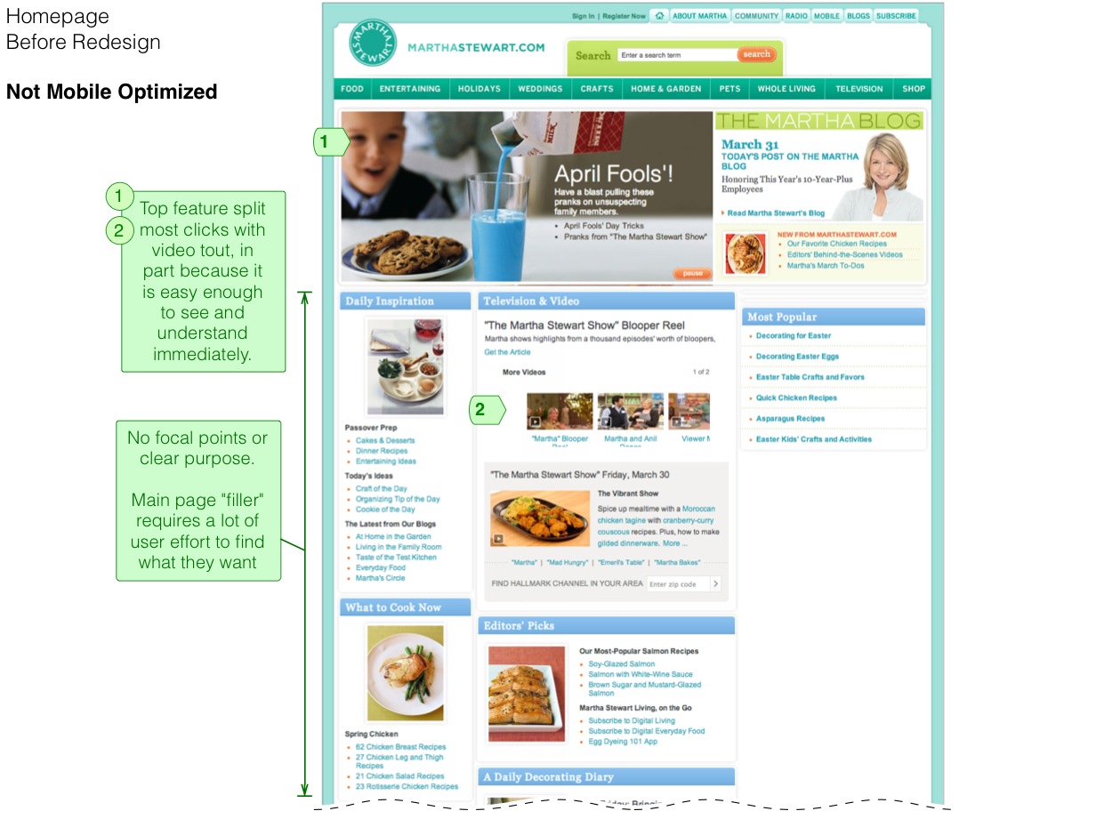
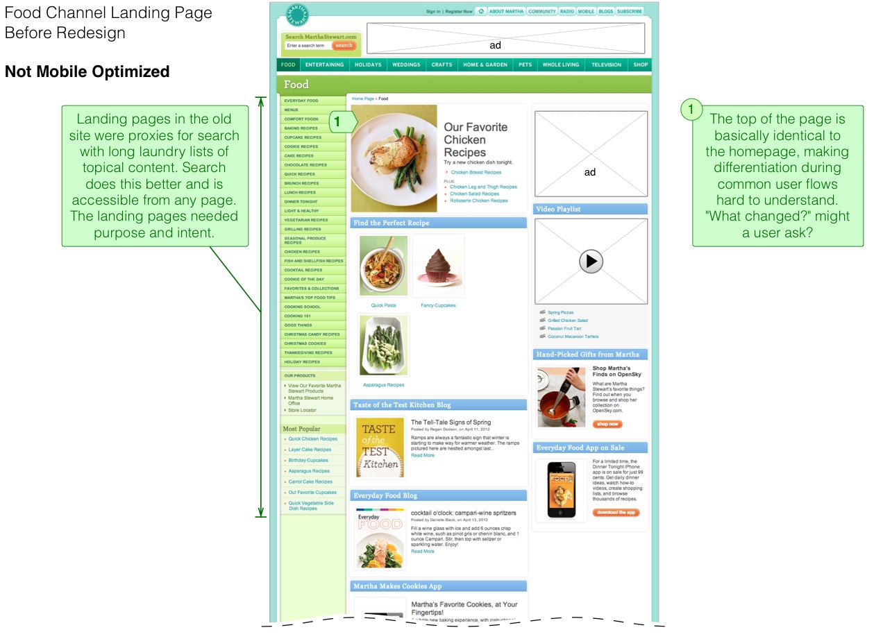
- Modernize the information architecture. The old IA was a proxy for search with every facet of the IA exposed. We made a better search to solve the discovery issue, and gave landing pages true user purpose again.
- We used brand strategy guidelines from Method, and several card-sorting tests, to arrive at broader, more actionable verticals and mega-menu strategy. The mobile landing pages were tasked with mirroring the content of mega-menus.
- In support of the IA, we also recommended horizontal themes as recirculation across vertical segments, such as techniques, practical advice, site wide popularity, and Pinterest activity.
- We evangelized tagging all of our content to produce dynamic faceted experiences.
Please note that, when possible, I have included older screenshots of the site before my tenure, but this information is incomplete.