Full Design Cycle of a New Search Concept
From sketch, to wires, to prototype, to user testing, and finally production.
Client: Martha Stewart Living Omnimedia
Role: Director of User Experience



Description:
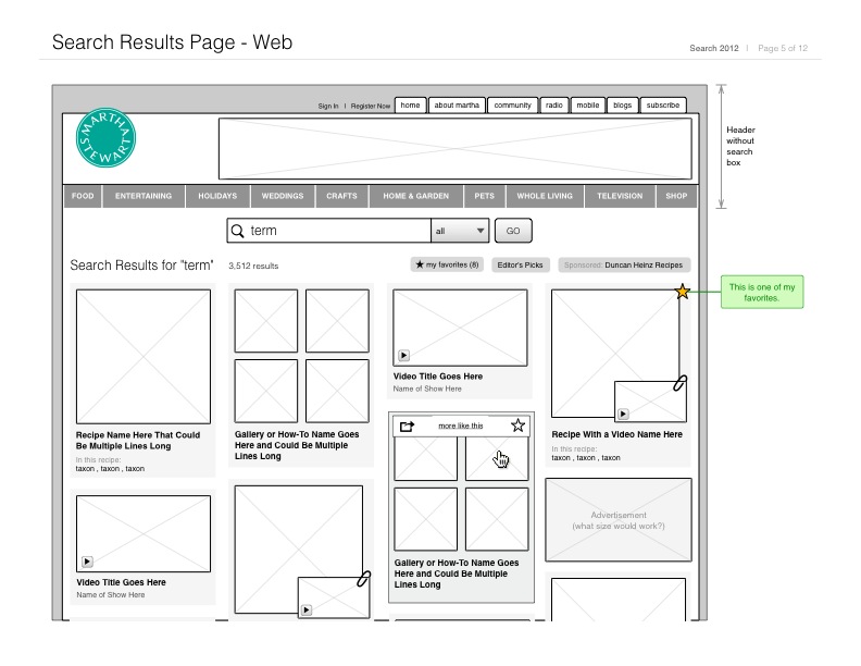
I wrote this prototype from scratch, which was later evolved by our production front-end staff when we decided to enter user testing. The prototype is not responsive, but you may try the following functionality:
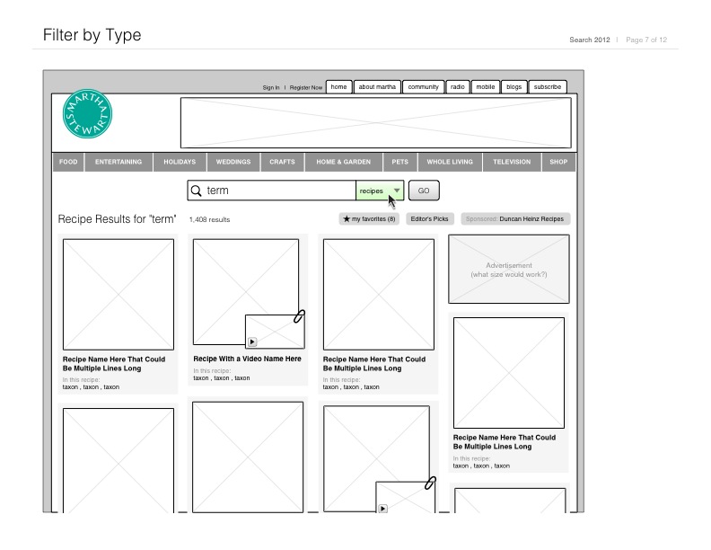
- Click through to search results to see intended filtering behavior.
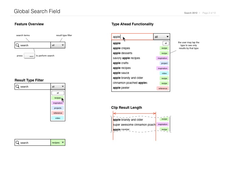
- Try search auto-complete by typing some letters- at least 3.
- Scroll down the page to see sticky search bar.
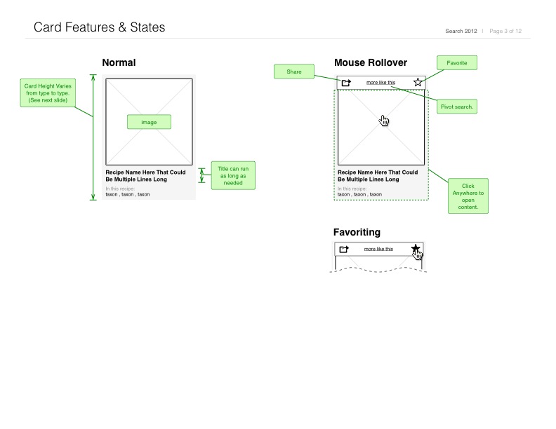
- Favorite items with the star icon. Notice favorite count increase and decrease accurately.
- Share an item- fake UI to simulate possible share feature.
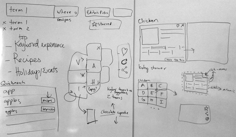
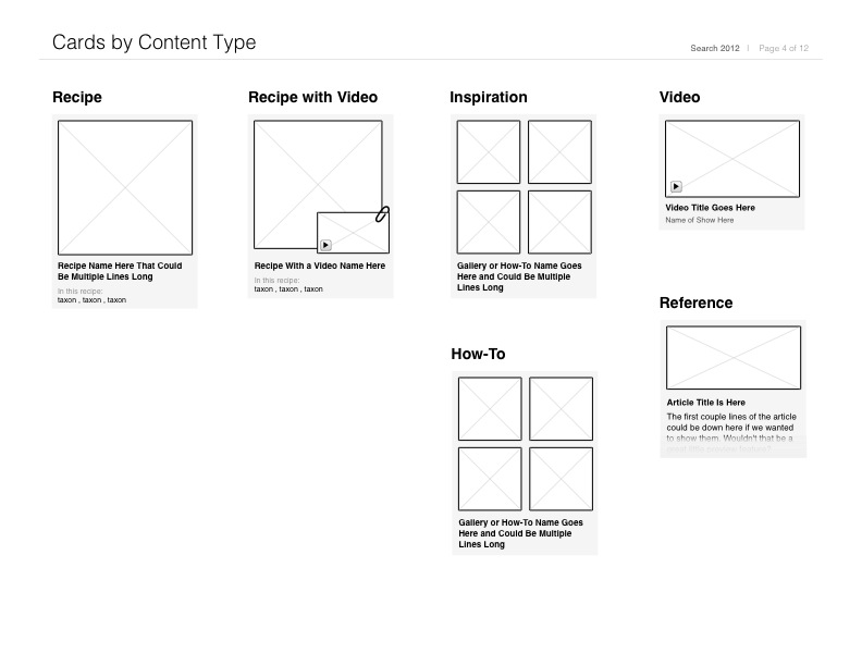
The intent was to show interaction patterns and nuance to senior staff. I've included the intitial sketch and wireframes above. After a couple rounds of internal stakeholder feedback, we decided to hire a proctor to conduct in person usability testing. With the results, we decided to remove the display variances between content types, and ensure people who were less visual had enough text initially available to make proper decisions. Many of the features made it into the product system on MarthaStewart.com today (as of December 2013.)